This is to be a workshop for interested 4th and 5th grade Sunday schoolers
Whether for photos, videos, or another visual art form, composition is key.

C
O
M
P
O
S
I
T
I
O
N

Light: This is the foremost of the 10 elements so important to photography, videography, cinematography or visual art in general. The word "photography" means painting with light.
Images that are shot without attention to composition will be less effective in conveying a message, just as words that are uttered without thought.
The image on the left has a third "figure" of a shadow that reinforces the power of the standing figure conducting the interview of this "criminal" suspect https://youtu.be/P0ydr8w5BxQ .
The above image has the element of Framing to emphasize the interest in the subject the guys in the hallway have : https://youtu.be/CIWfMCpjZh4 .
One of the most popular visual mediums, of course, is the cartoon. The 10 elements of composition are important tools to communicate a message here, too. There are just two Colors here, the Carolina Blue and State Red. Here, at least, Red dominates, with the caption, "This will make a swell sweater!"
To redeem this website, let's use the Old Well as an iconic Shape. It stands out for its classic Greek architecture. Similar columns adorn the South Building directly across the street on this campus, and giving it proper reverence is shown with the Distance and Angle element. Looking up from the low angle adds to its stature.


The Golden Means of Classical Greece was used to arrive at pleasing portions while also giving a center of interest. This gave us the 4 x 6 inch size for photos and the "rule of thirds." The subject takes one third or two thirds the space, and the horizon also one third or two thirds but NOT centered. Now, say all that with a straight face as you view these GOOGLE-EYEd subjects.
The first photo is also an example of proper Positioning of the Subject. If centered, the subject is often static when it's more desirable to be dynamic. Yes, Wilson's askew glance adds yet another dimension.
Cropping is still the photographer's main editing tool, but try this zooming in or out and positioning the camera before snapping the picture. Do not crop at the knees, wrist, neck, elbows, ankles or any other joint to avoid a sense of an amputation.
This second photo shows Depth well. The three subjects are in a line converging towards the horizon and not in front of it. It is not the feel of a "mug shot in a police line-up." The light from the flash also adds a contrasting darkness to the surroundings and brings the subjects out from the background.


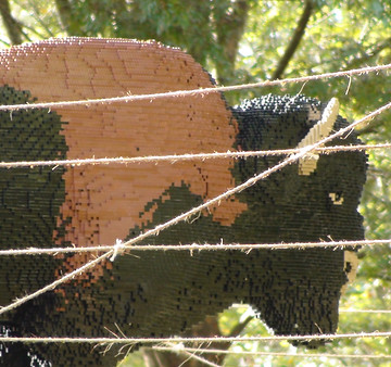
From a distance you'd think this buffalo is behing the fence with some calves. A close-up reveals in more detail another
element of composition, none other than Texture: assumed-to-be locks of hair are really interlocking legos.
In our culture, we read from left to right, which also gives a set orientation for looking at photos or other works of art. So, the element of Leading the Viewer's Eye most easily goes left to right as well.
Look at all the lines that prompt us to "read" this photo:
1) the arms _______________________
2) the spray nozzles ___________________
3) the sprays themselves ____________
4) the directions of the heads ___________


_JPG.jpg)
The tenth element of composition is Pattern , which is a repetition of shapes or colors to add unity or purpose, etc. This is here all wrapped up into one big ball; usually there are separate parts repeated in a picture.
Two Workshop Ideas immediately spring to mind: 1) have students focus on a set one or two of these elements in their environment and capture these effectively as photos. A joint effort might be telling a story with voice-over that uses an appropriate element until all 10 are used.
All of these elements are conventions, guidelines or shared societal values or ideals for what, generally, is appealing visually. There are exceptions, like a Picasso or a Mondrain. One convention for video or broadcast news is where the stand-up interviewer and the interviewee are to look.
2) Have interviews of students and staff who look at a work of art and give an opinion of what can be seen or appreciated. Some of the words of each interview could be used over the "B-Roll," cutaways of the art seen on the screen. The interviewer alone would look at the camera and do a stand-up. The use of interviewer and interviewee are given with some measure of success in these segments:


Reality TV shakes things up, but normally the interviewer, as the storyteller, may look directly into the eyes of the camera and at the person interviewed. The person interviewed can look at the interviewer but, as a character in the story, is not to look at the camera.
2001 Fashion at PCHS
Snow and Teacher Conspiracy
Dance-off 2010
Gum Ban
* These Twitter/Facebook links purposefully don't work: we could do with less social media!